Thursday, December 17, 2009

Saul Bass

Saul Bass :: Motion, Lines, Movies

Saul Bass was a successful graphic designer who essentially turned opening film titles into an art form. He was a master of film title design, working on over fifty films throughout his lifetime. He worked with some of the greatest directors of all time, most notably Alfred Hitchcock, Stanley Kubrick, and Martin Scorsese. In addition to working on opening and closing graphics for films, he designed some of the most recognized logos of his time, including the sixth AT&T logo and Continental Airlines “jetstream” logo. Always well respected, Bass contributed to many areas of graphic design.

Growing up in New York and constantly drawing as a child, Bass always had a wild imagination. He attended the Art Students League in Manhattan and then went on to study with Gyorgy Kepes at Brooklyn College. He worked as a graphic designer in NYC studios, but in the mid 1940s decided to move out to California. After designing a movie poster for Otto Preminger, he was so impressed he was commissioned to create the title sequence for Carmen Jones. He continued to create a few more title sequences, but it was The Man with the Golden Arm that created a sensation.

Bass’s most notable film title animation was for The Man with the Golden Arm in 1955. Before this movie, when films were played at theaters the curtain did not open for the title credits because they were so boring. Never before had the itle credits been so symbolic of the film that followed. Yet, when The Man with the Golden Arm played in theaters the projectionists were given specific instructions to open the curtain for the credits, as Bass started a new trend of interesting and artful title credit animation. The Man with the Golden arm used jarring lines once again. It is in this movie that there is the most literal foreshadowing to elements of the movie. The arm represents addition, and the staggered jagged piecing together of the graphic symbol foreshadows the character’s plunge into misery.

Some of Bass’s most successful credit sequences were accompanied by the music of Bernard Herrmann, a renowned score writer. They worked together in Vertigo, Psycho, and Cape Fear. It’s a Mad, Mad, Mad, Mad World was his longest film credit, reaching four minutes. The color scheme is simple, but the animation is anything but. While he was used to working on serious films with Alfred Hitchcock, It’s a Mad, Mad, Mad, Mad World gave Bass a chance to make humorous credits, as the movie was filled with just about every famous comedian of the era. Bass created the opening credits and movie poster for West Side Story. Once again Bass uses lines to prelude to a scene of buildings. More so than other films, this credit reel focuses on color, as the lines stay stagnant until the end when they reveal they are based on the island of Manhattan. Around the World in 80 Days had the audience wondering when they'd be seeing anything by Bass, as there was no animated opening credits To the crowds surprise, in this piece he created the ending titles. He uses a myriad of illustrations that are basically a summary of the movie.

Moving beyond just opening and closing credits, Bass also directed short films from the 1960s through the 1990s and won Academy Awards and nominations for these shorts. His success in the area led him to become a desired consultant for filmmakers, especially for movie climaxes. His most notable scenes include the shower scene in Alfred Hitchcock’s Pycho, the final battle scene in Stanley Kubricks’sSpartacus, and the racing scenes in John Frankenheimer’s Grand Prix.

He had a dream of being a feature film director himself, and that dream came true in 1974, the movie was entitled, Phase IV. Unfortunately, the feature had little to no success and he soon returned to his roots of commercial graphic design. It was at this time that he created the famous corporate identities of United Airlines, AT&T, Minolta, Bell Telephone System, and Warner Communications.

He was coerced into returning to film credits in 1987 and 1988 to work on James Brooks’ Broadcast News and Penny Marshall’s Big. Soon after, Martin Scorsese became a long-term partner. He created credits for Goodfellas and Cape Fear, along with graphics for The Age of Innocence and Casino. Casino was Bass’s final movie credit animation before his death.

Bass was honored by being commissioned to design the posters for the Oscar Awards ceremonies between 1991 and 1996, as well as the poster designs for the 1984 Olympic Games in Los Angeles. His awards include Honorary Royal Designer for Industry from the Royal Society of Arts of London in 1964, honorary doctorate degrees from the Philadelphia College of Art and the Los Angeles Art Center College of Design, and membership in the Sundance Film Institute in Utah. He also has and has had exhibitions of his work at the Cinematheque Francaise in Paris, the Museum of Modern Art in New York City, the U.S. Library of Congress in Washington, D.C., in Amsterdam at the Stedlijk Museum, and in Czechoslovakia at the Prague Museum.

On April 25, 1996 Bass died of non-Hodgkin’s lymphoma and was survived by his wife and creative partner, Elain Makatura, and two children, Jennifer and Jeffrey. His work will always be looked at as revolutionary, and has and will continue to survive as respected pieces of artwork.


Sources:

http://www.notcoming.com/

http://designmuseum.org/design/saul-bass

http://www.aiga.org/content.cfm/medalist-saulbass

http://www.bass-saul.com/

http://www.answers.com/topic/saul-bass


posters by Saul Bass
movie posters by Saul Bass

logos by Saul Bass

Sunday, December 13, 2009

Carla Gannis :: Speaker


Carla Gannis came to speak in our class today. See work above.

Major Points::

  • Majored in piano and oil painting
  • appropriation art, mash ups, media fragments -- Richard prince, blowing up of marlborough man ads
  • ....Wears 3 hats
  • Thin line between fact and fiction, often blurred
  • "sublimation "
  • Corporate Artists, Peter Haley?
  • Making the familiar unfamiliar
  • Post-Human...beyond the natural human experience. Augmentation.

sick poster


Core77 posts The ABC's of Branding poster by Jason Dean. This is a great ode to logos that have become so iconic throughout the years. I especially love that Volkswagen's logo is "V" AND "W!"


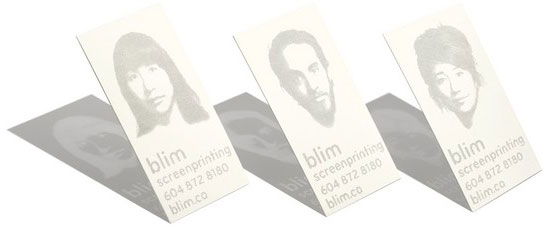
great business cards!

Designboom posts these fantastic business cards by "blim," a community arts center that offers workshop in screen printing, among others. The cards are printed with laser cut perforations in the style of screen print. When held in the light, the shadow is a negative version of the card.

I think these cards are really special because they are so interesting and memorable without being too flashy, corny, or pretentious.

Weird Art Show

http://www.designboom.com/weblog/cat/8/view/8446/preliminares.html

BEautiful Indoor Plant Decoration!


Designboom posts about this great decorative plant holder. There are two different mirror sets on this planter, the bigger diagonals, and then smaller ones under the plants. This reflects the growth and makes it appear bigger! The call it a "grass mirror" and it's by h2o architects.

Tuesday, December 8, 2009

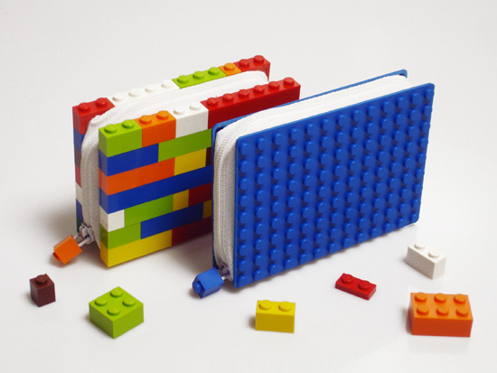
Yet another lego post!!


Found on LARK.com, this outrageous car commercial takes creativity to the next level.


Done with regular sized legos, this commercial must have taken HOURS.

And in other lego news.. less complicated, but oh so cute and a good idea!


Speaking of iPod docks


You could buy that fancy dock I posted in the previous, OR, you can MAKE your OWN using binder clips. That's right. BINDER clips. Found on the GEEK section of Fark.com, there's an instructional video!

Thursday, December 3, 2009

Lego Stop Action!

Core77 posts this Matrix scene remake...done in yes, you guessed it. LEGOS! This scene is particularly well done, as it mimics the special effects so well-known and loved by Matrix fans, extremely well. This is just another of many lego tribute videos!


Friday, November 27, 2009

iPod Speakers

These classy speakers are a site for sore eyes! Simple and classic, curious as to how good the sound quality is. Posted in The Design Blog, they are available in maple and cherry wood. "Clutter free music" is an appropriate term.

Compact Furniture!

The Design Blog posts about a great new furniture piece. The design is great for small apartments where space is limited. I know as someone looking into a (most likely small) apartment on a limited budget, I'd definitely purchase this!

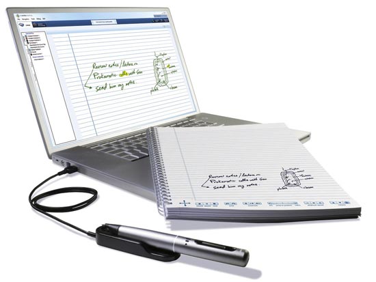
Live Scribe

Livescribe is a pen that records notes digitally and audibly. Designboom posts of how they recently updated their software to include games, music, and translation to another language. This a pretty cool product getter better. I think the best part is how you can touch the part of the notes and it will bring you to the audio from that part of the lecture!

Cute mushroom hook!

Japanese designer Masako Sato creates this cute mushroom hook!

I think there's a great market for cute home accessories like this. They are unique and stylish. I could even see places like children's stores, schools, and places like that buying in bulk!


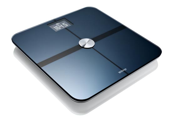
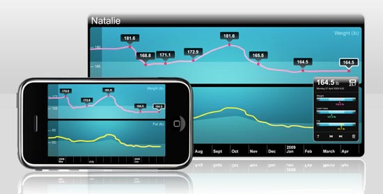
WiFi Scale

Designboom posts about a Scale that has WiFi, enabling it to transfer data directly to your computer or mobile device. The website plays the fitness card, making it seem like if you buy this scale you will be able to lose weight more easily, because you can keep track of things like BMI and body composition. I think this is a cool idea, but I doubt it will be the turning point for people to become healthier!


Digital Camera with Projector!

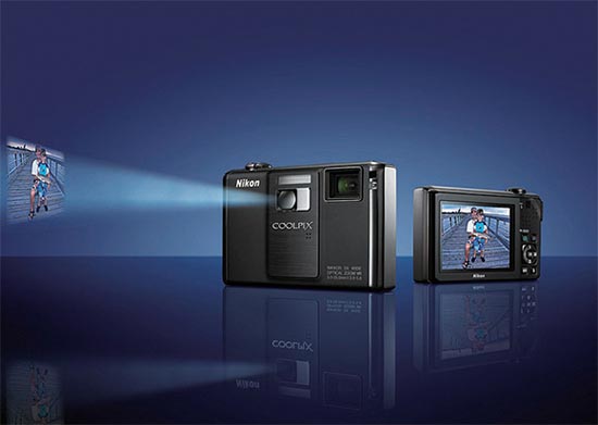
Designboom posts about a great new Nikon camera which features a projector! In addition to this the camera also boasts 12.1 megapixels and a 2.7 inch lcd display. The projector isn't of the highest quality, but the idea is there. This way people don't have to crowd around the little camera...it projects onto any flat surface. I'm pumped to see if this idea will catch on!

Monday, November 23, 2009

Poster Sketches for the Student Art Show

Poster Sketches for the Student Art Show

Sketch 1:
I would print out S,T,U, etc on letter paper, with the letter taking up the whole page. Then I'd photography the paper hanging with an interesting background (think brick wall, wildlife, birdcage, etc). Then collage them together.


Sketch 2:
The idea with the head sillohette, with type filling the head. the type would be fine arts classes.


Sketch 3:
Thick block letters masked by "art" textures. Abstract photos of things like paint palettes, still life stuff, MAC puters, etc. - OR - the same idea in reverse. High res image of a close up of a palette with the letters knocked out.


Sketch 4:
FB done artsy. type in FB font, but painted. Info made to look sort of like a profile.


Sketch 5:
Simple basic font. With Rectangle/simple line graphics. All the same colors (tinted and whatnot) but diff textures, referring to diff. departments (paint, pencil, blog screen print, etc). Very subtle textures, but enough to notice, oooh thats paint, etc. Or colors could be CMYK/RGB idea.


Sketch 6:
Same idea as 2, but instead of head silhouette, just a circle/dot.

Thursday, November 19, 2009

Bringing Urban to your living room

Designboom posts about the "Urban Collective," a new collection of furniture created by the emotion lab. It's a set of furniture based on urban city features like scaffolding, dividers, and lights!


Another product from emotion lab, screen light.

Tuesday, November 17, 2009

Saul Bass

Saul Bass :: Motion, Lines, Movies

Saul Bass was a successful graphic designer who essentially turned opening film titles into an art form. He was a master of film title design, working on over fifty films throughout his lifetime. He worked with some of the greatest directors of all time, most notably Alfred Hitchcock, Stanley Kubrick, and Martin Scorsese. In addition to working on opening and closing graphics for films, he designed some of the most recognized logos of his time, including the sixth AT&T logo and Continental Airlines “jetstream” logo. Always well respected, Bass contributed to many areas of graphic design.

Growing up in New York and constantly drawing as a child, Bass always had a wild imagination. He attended the Art Students League in Manhattan and then went on to study with Gyorgy Kepes at Brooklyn College. He worked as a graphic designer in NYC studios, but in the mid 1940s decided to move out to California. After designing a movie poster for Otto Preminger, he was so impressed he was commissioned to create the title sequence for Carmen Jones. He continued to create a few more title sequences, but it was The Man with the Golden Arm that created a sensation.

Bass’s most notable film title animation was for The Man with the Golden Arm in 1955. Before this movie, when films were played at theaters the curtain did not open for the title credits because they were so boring. Never before had the itle credits been so symbolic of the film that followed. Yet, when The Man with the Golden Arm played in theaters the projectionists were given specific instructions to open the curtain for the credits, as Bass started a new trend of interesting and artful title credit animation. The Man with the Golden arm used jarring lines once again. It is in this movie that there is the most literal foreshadowing to elements of the movie. The arm represents addition, and the staggered jagged piecing together of the graphic symbol foreshadows the character’s plunge into misery.

Some of Bass’s most successful credit sequences were accompanied by the music of Bernard Herrmann, a renowned score writer. They worked together in Vertigo, Psycho, and Cape Fear. It’s a Mad, Mad, Mad, Mad World was his longest film credit, reaching four minutes. The color scheme is simple, but the animation is anything but. While he was used to working on serious films with Alfred Hitchcock, It’s a Mad, Mad, Mad, Mad World gave Bass a chance to make humorous credits, as the movie was filled with just about every famous comedian of the era. Bass created the opening credits and movie poster for West Side Story. Once again Bass uses lines to prelude to a scene of buildings. More so than other films, this credit reel focuses on color, as the lines stay stagnant until the end when they reveal they are based on the island of Manhattan. Around the World in 80 Days had the audience wondering when they'd be seeing anything by Bass, as there was no animated opening credits To the crowds surprise, in this piece he created the ending titles. He uses a myriad of illustrations that are basically a summary of the movie.

Moving beyond just opening and closing credits, Bass also directed short films from the 1960s through the 1990s and won Academy Awards and nominations for these shorts. His success in the area led him to become a desired consultant for filmmakers, especially for movie climaxes. His most notable scenes include the shower scene in Alfred Hitchcock’s Pycho, the final battle scene in Stanley Kubricks’s Spartacus, and the racing scenes in John Frankenheimer’s Grand Prix.

He had a dream of being a feature film director himself, and that dream came true in 1974, the movie was entitled, Phase IV. Unfortunately, the feature had little to no success and he soon returned to his roots of commercial graphic design. It was at this time that he created the famous corporate identities of United Airlines, AT&T, Minolta, Bell Telephone System, and Warner Communications.

He was coerced into returning to film credits in 1987 and 1988 to work on James Brooks’ Broadcast News and Penny Marshall’s Big. Soon after, Martin Scorsese became a long-term partner. He created credits for Goodfellas and Cape Fear, along with graphics for The Age of Innocence and Casino. Casino was Bass’s final movie credit animation before his death.

Bass was honored by being commissioned to design the posters for the Oscar Awards ceremonies between 1991 and 1996, as well as the poster designs for the 1984 Olympic Games in Los Angeles. His awards include Honorary Royal Designer for Industry from the Royal Society of Arts of London in 1964, honorary doctorate degrees from the Philadelphia College of Art and the Los Angeles Art Center College of Design, and membership in the Sundance Film Institute in Utah. He also has and has had exhibitions of his work at the Cinematheque Francaise in Paris, the Museum of Modern Art in New York City, the U.S. Library of Congress in Washington, D.C., in Amsterdam at the Stedlijk Museum, and in Czechoslovakia at the Prague Museum.

On April 25, 1996 Bass died of non-Hodgkin’s lymphoma and was survived by his wife and creative partner, Elain Makatura, and two children, Jennifer and Jeffrey. His work will always be looked at as revolutionary, and has and will continue to survive as respected pieces of artwork.


Sources:

http://www.notcoming.com/

http://designmuseum.org/design/saul-bass

http://www.aiga.org/content.cfm/medalist-saulbass

http://www.bass-saul.com/

http://www.answers.com/topic/saul-bass


posters by Saul Bass
movie posters by Saul Bass

logos by Saul Bass

Monday, November 16, 2009

showing off the nostalgia!

http://www.designboom.com/weblog/cat/16/view/8175/nintendo-business-card-case.html

Monday, November 9, 2009

Tim Burton at MoMa!

Tim Burton's Exhibition at MoMa opened this Sunday! I got a chance to see some preview pieces Friday. The show features everything from doodles and sketches to production stills and polaroids. MoMa has put together a FANTASTIC exhibition website where you can view most of the pieces online.


"The man with permanent seeing eye dogs." hehe.